
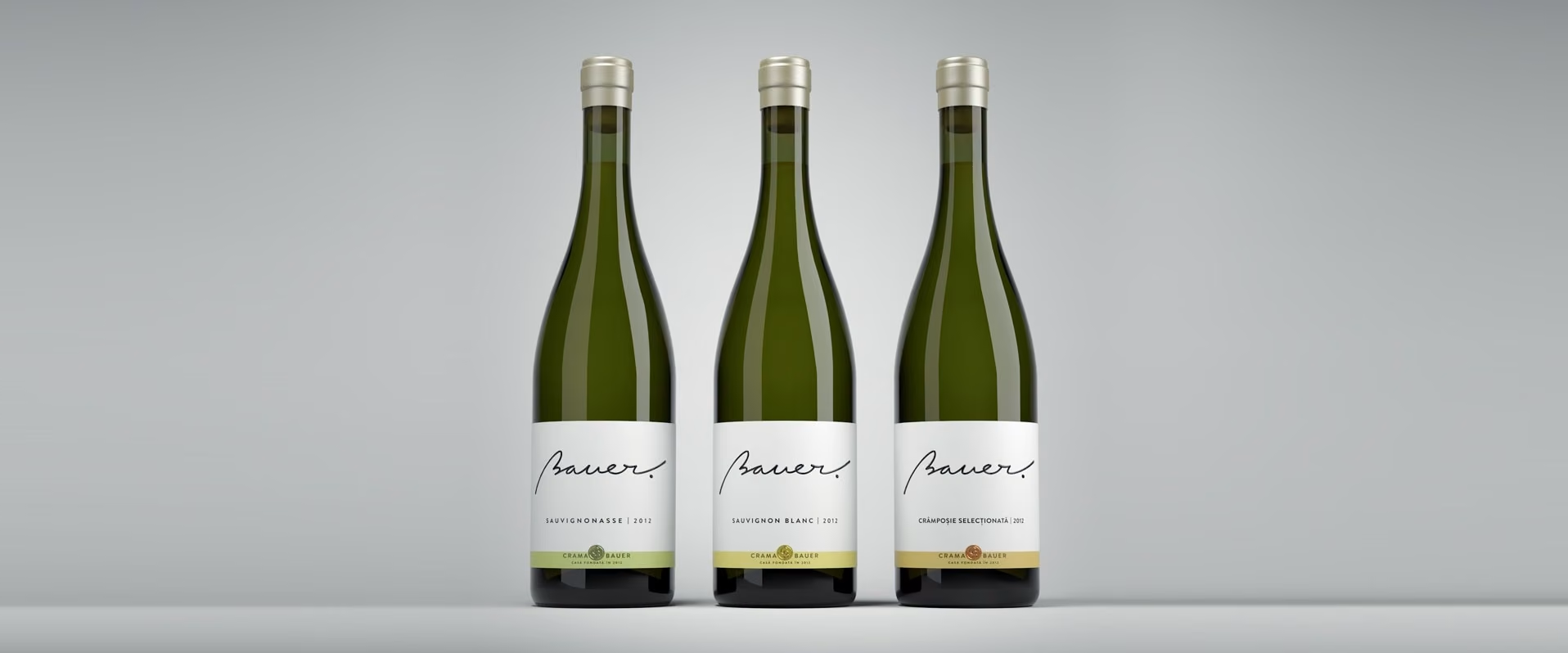
Character and authenticity
We peeled off every convention there was when it came to this project, simplifying the message to its very core. And that is because, like ancient sailors, Oliver Bauer throws away in a sea of confusions and fabrications a message that is, in itself, authentic. A message with character. A bottled one.
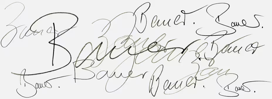
A signature wine
We’ve collected autographs from Bauer family members, searching for strength, elegance and playfulness – each of them featured by Bauer’s fine wines.
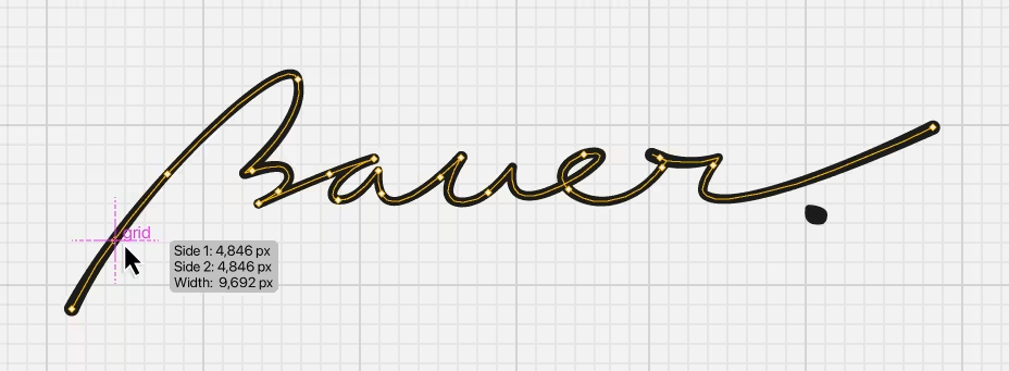
Bauer.
We’ve created a signature inspired from all of them, without being one in particular. Because this is the Bauer wine signature. Period.
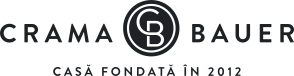
Bauer Winery
A simple, elegant monogram for the business entity behind the wine. The C springs out of the B like the new vines.
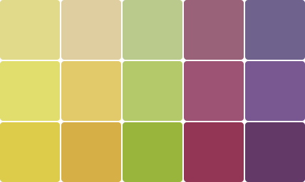
The colour palette
Each wine inspired a color, not identical with the color of the wine but in harmony with its notes. Together they make the Bauer colour range.
What really matters
Corporate identity begins with branding, but real brand development goes much further.

The label
Building up the signature wine identity, we have created a label to support a wide, strong signature, embossed on light textured paper. After researching the labels on the market we chose a minimalistic design. The bottle can be easily spotted on the shelf, instantly communicating the brand – Bauer – and the type of wine – with the support of the color strip at the lower end of the label.