
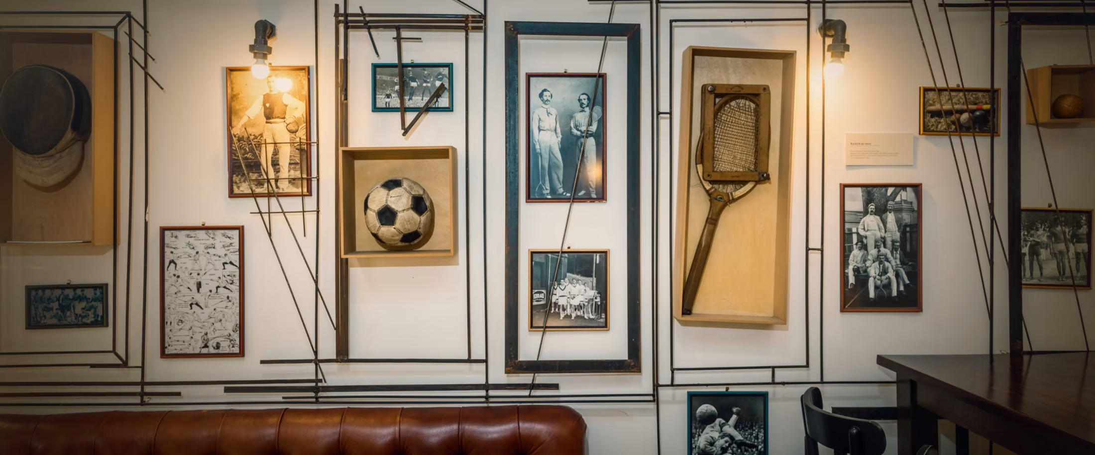
A step forward
Respecting the venue's legacy, we distilled the brand to its purest form, shedding the ornamental shell to uncover a timeless, sophisticated, and lasting core.

The new logo
Stripped of descriptive elements, the new logo brings clarity and sophistication to a brand that brings gastropub culture to an audience eager for authentic experiences. The organic, typographic character of the primary wordmark moves away from the sterile precision of digital print, evoking instead tradition and authenticity.

The colour palette
Organic, culinary-inspired colors designed to create a warm, harmonious balance between the background, the primary wordmark, and the accent elements.
The new menus
Reflecting the overarching identity shift, the new menus echo the core brand pillars of familiarity, excellence, comfort, and a touch of sophistication.
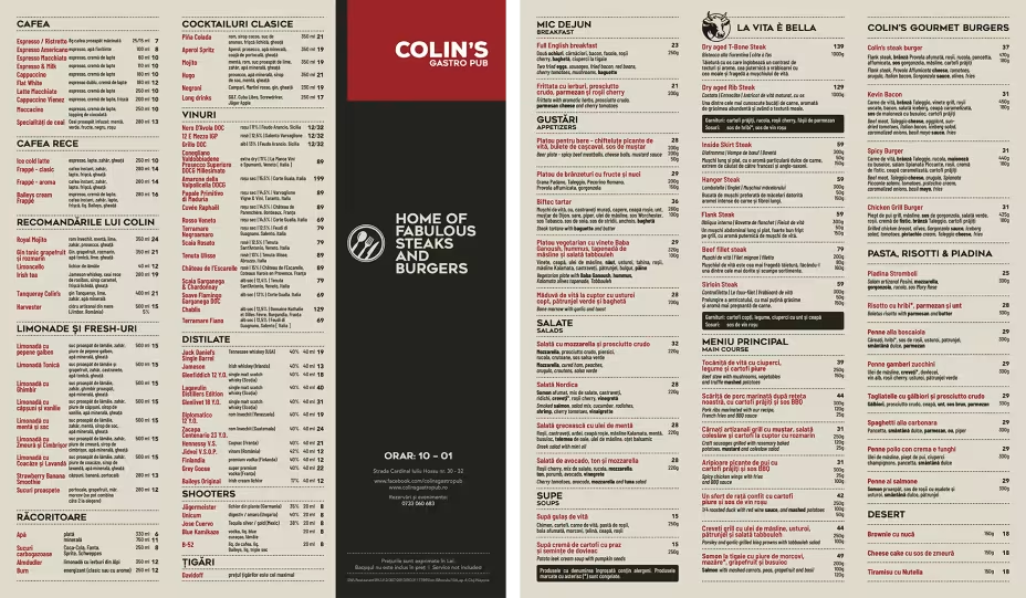
The Main Menu
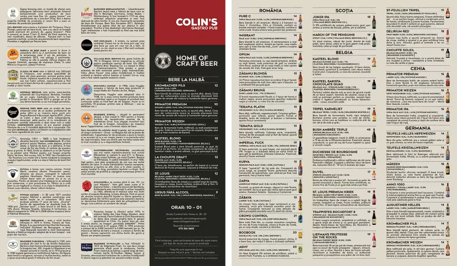
The Beer Menu
Events and more
Colin’s is the perfect venue for everything from a quick coffee or business lunch to unforgettable, milestone events. Or just a beer or two.
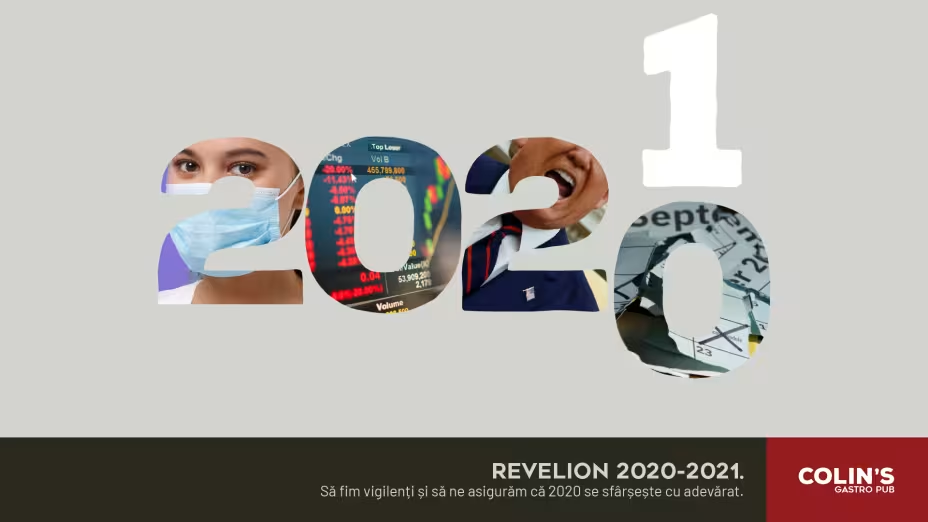
A complicated year
Unprecedented, disruptive, and surreal, the year 2020 changed the entire world through sudden lockdowns, global health crises, and deep social shifts, forcing humanity into an isolated routine of remote work, social distancing, and collective uncertainty. Therefore everyone showed up just to ensure that 2020 was truly gone.
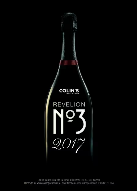
The good old days
An invitation to celebrate the passage of time, honoring years that felt quietly mundane back then.

Colin's Christmas
Santa has a long night ahead of him, so he decided to quench his thirst first. Or so the waiter says... This ad was produced by Hodis Film before our rebranding, but we feel it still belongs here.